What is color theory, and how do you use it?
Color theory is something every content creator should know. But what are the basics, how do you use it, and what are the best examples?

Color theory is something every content creator should know. But how do you use it, what are the basics, and what are the best examples? Let’s dig into all that today.
What is color theory and why is it important?
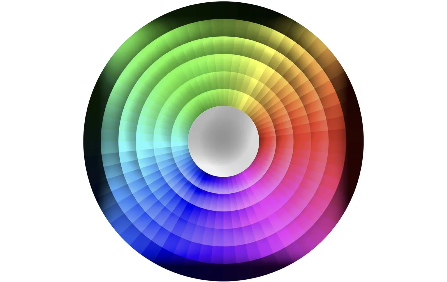
In simple terms, color theory is how designers, artists and content creators communicate with their audiences through color. It’s based on a color wheel, like the one below. This wheel combines all the primary, secondary and tertiary – nope, we didn’t know what that meant, either – colors you’d ever need. Understanding these colors, how to combine them, and how to evoke emotion is the key to the practice.
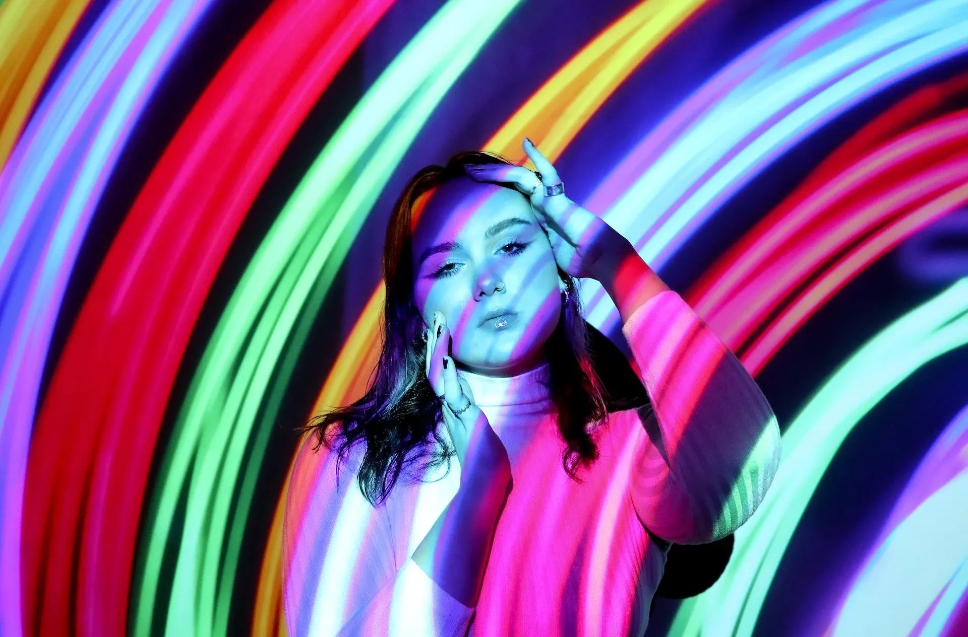
Color theory is used to create pieces of art, and it can also be found in advertisements, TV, movies, promotional posters and pretty much anything else. Designers use color theory to appeal to human psychology, culture, optical ability and more – the wheel’s just the start!
Who invented color theory?
The core elements of color theory have been floating around for thousands of years. However, it’s widely accepted that Sir Isaac Newton is the true OG, having made the first color wheel way back in 1666. He used it to prove that colors are created by human perception, rather than just being there.
What are the color theory basics?
Color theory is held together with some basic rules. We’ve broken them down below.
The color wheel
The color wheel is the key to everything. It’s represented by a 360° circle, which you’ll probably have seen if you’ve ever edited a photo or video. Depending on which medium you’re working in, there’s a different color mixing model to stick to. They each comprise primary colors, which can’t be produced by mixing any other colors in the model; secondary colors, which spring up when you blend two primary colors; and tertiary colors, which you can make by mixing a primary and secondary color.
There are three main color mixing models. They are:
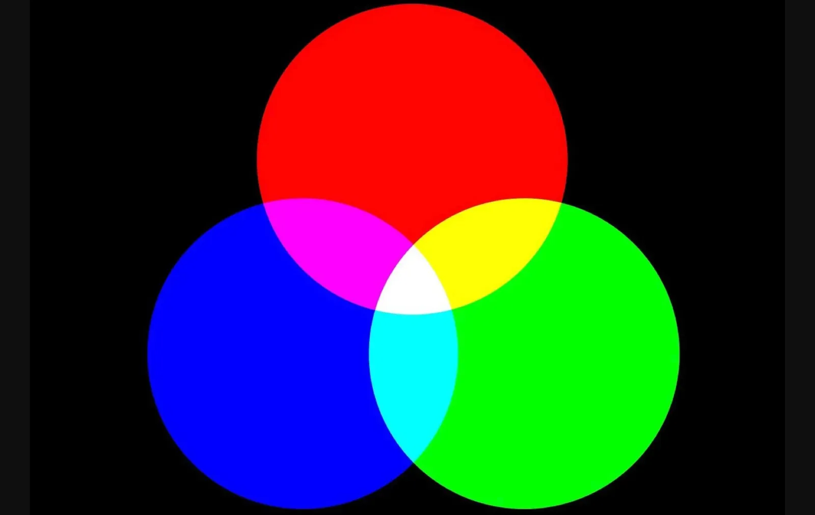
- RGB, which stands for red, green and blue. These are the primary colors, and the colors of light. The secondary colors in this system are yellow, cyan and magenta. The tertiary colors are not set in stone, but seen on a color wheel, they can be assumed to be orange, chartreuse, spring green, azure, violet and rose. This color system is used when working with color produced by the light of a TV or computer screen, meaning you’d use it on photo and video editing apps and software like Photoshop, Premiere Pro, After Effects, and so on. So, for digital content, RGB is your go-to!
- CMY, which means cyan, magenta and yellow are the primary colors. The secondary colors here are red, green and blue – the primary colors for RGB! CMY’s tertiary colors are the same as RGB’s. CMY is used for printing with ink, sometimes including black – also known as ‘key’ – as a primary color. This color system is called CMYK.
- RYB, which denotes red, yellow and blue as the primary colors. When it comes to secondary colors, you’ve got orange, green and purple. The tertiary colors include vermillion, amber, chartreuse, teal, violet and magenta. Painters, artists and designers use the RYB scheme to blend pigments.

Choosing the right color mixing model is important. If you use RGB and print it with CMY or CMYK, the colors won’t be true to what you had in mind. It’s also worth noting that you may see different names for some colors – red-violet may be referred to as magenta, and so on.
Color hue
Hue is another word for ‘color.’ That’s it. On a color wheel, each position represents a different hue. You can easily experiment with hue on photo and video editing software, as it’s represented by a number you can change.
Color value
This just means light and dark, stretching from white to black. Tweaking the color value will bring out a totally different character from your color. This is sometimes called ‘luminance.’
Color saturation
This refers to how strong your colors are. Low-saturation colors have less pigment and are weaker, while high-saturation colors are bright and rich with pigment. Like color hue and value, saturation can be edited in the color wheel of most modern editing software.
Color tint
This means adding a hue of white to a color. For example, tinting red will result in pink.

Color shade
Shade is the opposite of tint, adding black into the mix. If you shade red, you’ll end up with burgundy.
Color tone
Toning is the result of adding black and white to a color. This gray darkens the hue while softening the outcome, bringing down the contrast and intensity.
Warm and cool colors
This terminology might seem a little fluffy, but it’s crucial you know the difference between warm and cool colors. They help determine the mood of your content. John Carpenter’s classic movie ‘The Thing’ wouldn’t work if everything were sunkissed orange; everything is white, blue and black, to match the harsh environment.
You can separate the warm and cool colors by splitting the color wheel in half. Yellow, oranges and reds are warm, whereas greens, blues and purples are cool.
Why should you learn color theory?
Color theory helps you understand the relationship between colors and how the human eye perceives them. With this kind of knowledge under your belt, you can use color to your advantage. Figure out what makes people tick, tweak the lighting, scatter colored motifs through the scene, use a stark contrast of light and dark to emphasize the emotional weight of a scene – the possibilities are endless.
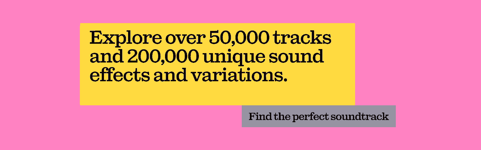
Whether you use color theory in film, TV, photography, graphic design or something else entirely, it will improve your content when done correctly. The same can be said for music. After all, bad music kills good video. Don’t let an ill-fitting track ruin your vibe. At Epidemic Sound, we have 50,000 tracks and 200,000 unique sound effects and variations to choose from. Check out the catalog below.
How to use color theory
Now you know about color theory and color wheels, it’s time to put it to work. Here are some color schemes you can adopt to create unique, inventive content. Given you’ll most likely be using a computer, these tips and tricks will be presented using the RGB color mixing model.
- Monochromatic: Take one hue, then create other elements from different shades and tints of your selection.
- Analogous: Use three colors that sit next to each other on the color wheel. To make a variant, throw some white into the mix to create what’s called a ‘high-key’ analogous color scheme.
- Complementary: Use two colors at opposite ends of the color wheel to create a striking contrast.
- Split-Complementary: This is also called ‘Compound Harmony.’ You can achieve this by adding colors from either side of your complementary color pair to dial down the contrast.
- Triadic: Take three colors that are equally distant from one another on the color wheel – for example, choose one color at 40°, another at 80°, and a third at 120°. This might not seem like the most eye-popping color scheme, but when you look at where you start and where you end, there’s a clear amount of contrast going on. Using a broad palette like this can help you create visually appealing designs.
- Tetradic: Take four colors, but not any old colors. You want to pick two sets of complementary pairs and, from those four options, crown one as the dominant color. This can help you create engaging, heavily themed designs – just go easy when balancing warm and cool colors.
- Square: This is a combination of triadic and tetradic. Pick four colors, but ensure they’re spaced evenly throughout the wheel.
What do different colors mean?
You can use color theory to express emotion without telling the viewer. Here’s a quick guide!
- Red: Love, blood, fire, strength, intensity, energy.
- Purple: Power, wealth, ambition, royalty, nobility.
- Blue: Trust, water, sky, stability, depth, tranquility.
- Green: Freshness, nature, growth, safety, money.
- Yellow: Energy, sunshine, brightness, cheerfulness, joy.
- Orange: Warmth, autumn, happiness, success, creativity.
You can even drain all the color and go grayscale – just old-school black and white.
What are some examples of color theory?
Some of the best color theory in film and TV – or anywhere, to be honest – is in ‘Breaking Bad.’ The award-winning series gave us a lot to look at, using color to depict characters’ feelings and motivations, sometimes even foreshadowing their actions.
“Color is important on 'Breaking Bad,’” said Vince Gilligan, the show’s creator, in an interview with Vulture. “We always try to think in terms of it. We always try to think of the color that a character is dressed in, in the sense that it represents on some level their state of mind.”
On top of that, the show used color grading to give footage a sense of place. For example, the scenes in Mexico became iconic – and very much memed – for their dusty, Wild West yellowness.

Color theory is also used to ensure accessibility within visual content. Maximum contrast is your best bet when considering people with low vision or color deficiencies. To read more about color theory and accessibility, head over here.
Now you know the basics of color theory, it’s time to put it into practice. Experiment, figure out what you want your audience to feel, and use color theory to make it a reality!
The perfect soundtrack can conjure a certain mood, vibe or setting that complements and elevates your pro-level color theory. If that’s your kind of thing, why not try Epidemic Sound?
Our catalog is high-quality, affordable, and safe. An Epidemic Sound subscription goes beyond royalty-free music, removing the headache of licensing and freeing you up to do what you do best. You can enjoy the safety of our license hand-in-hand with our massive catalog of 50,000 tracks, covering just about every genre you can think of. You’ll also gain unlimited access to our advanced search functions — finding the right sound’s never been easier.
It’s better than royalty-free. It’s worry-free. Get started with Epidemic Sound below.

Are you a video editor or filmmaker? Whether you’re an absolute master or just a beginner, discover what Epidemic Sound has to offer on our Epidemic Sound for Filmmaking page. Oh, and if you’re looking for some background music for your videos, we got you covered.
Related posts: